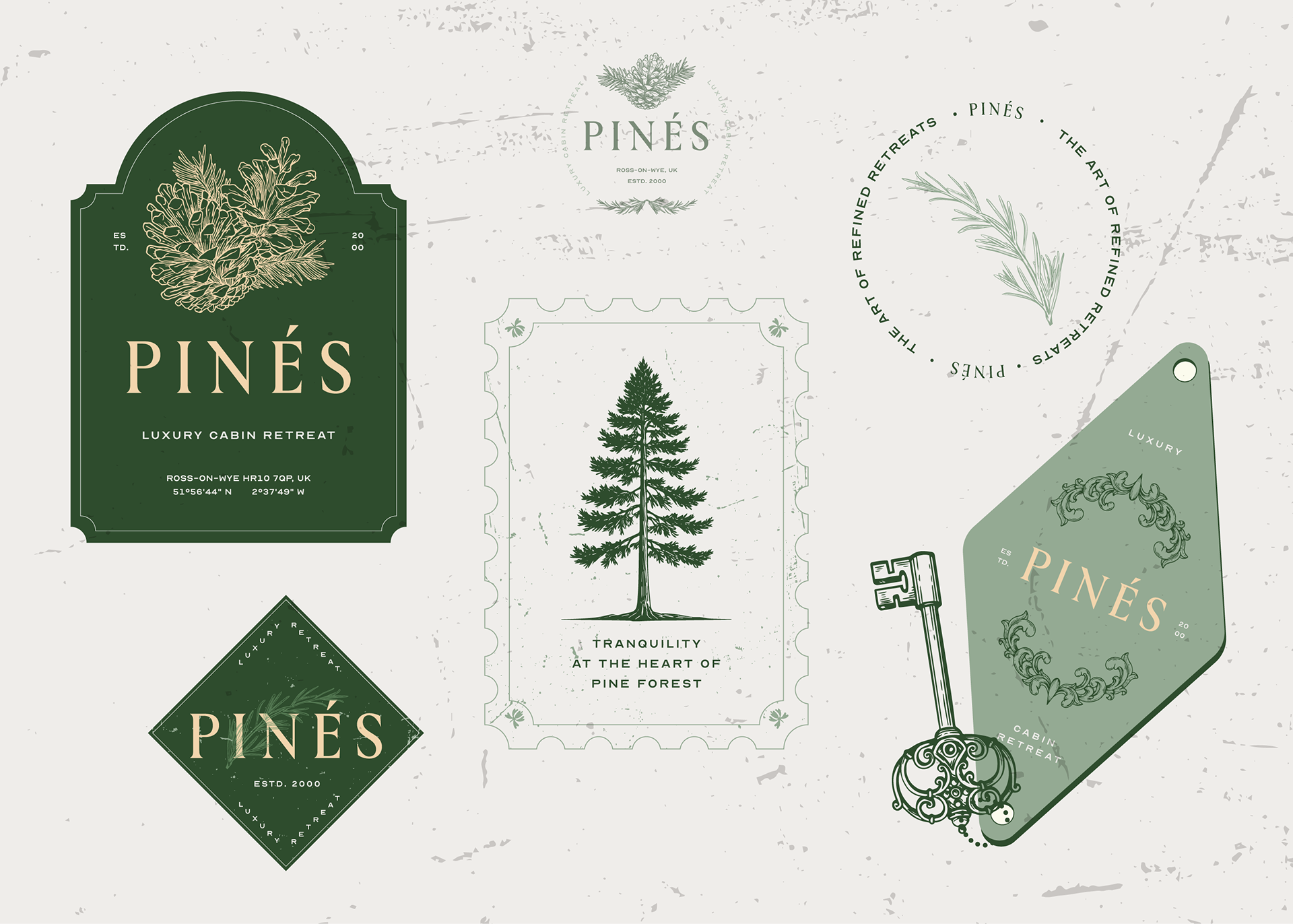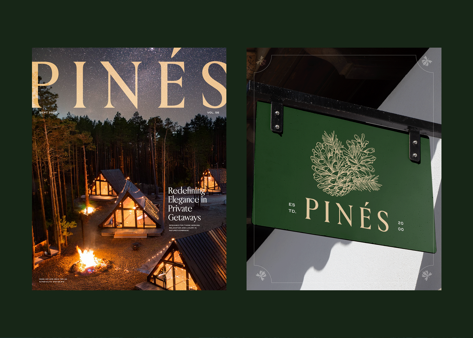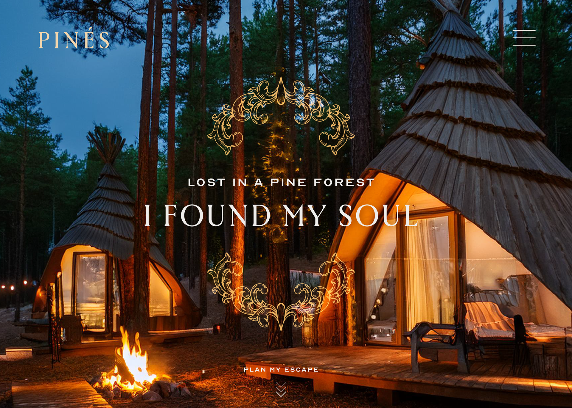
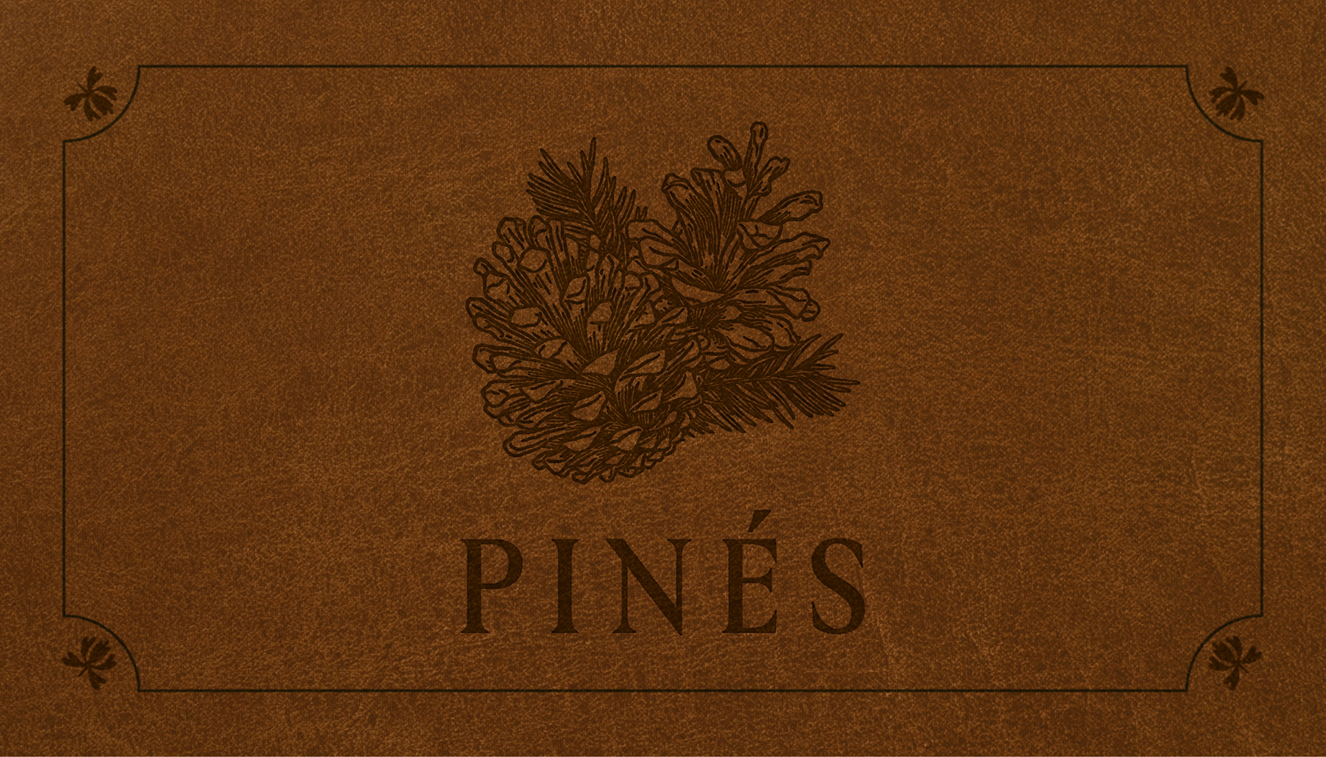
DESIGN OBJECTIVES
The brand identity design embodies Pinés' mission to promote tranquility and serenity in a
cabin gateway, using green shades as the primary branding color.
cabin gateway, using green shades as the primary branding color.
Instead of adopting a modern brand style that may seem cold and distant to some,
the design features a hand-drawn crest paired with an elegant logotype, conveying a sense
of warmth while remaining elegant and luxurious.
the design features a hand-drawn crest paired with an elegant logotype, conveying a sense
of warmth while remaining elegant and luxurious.
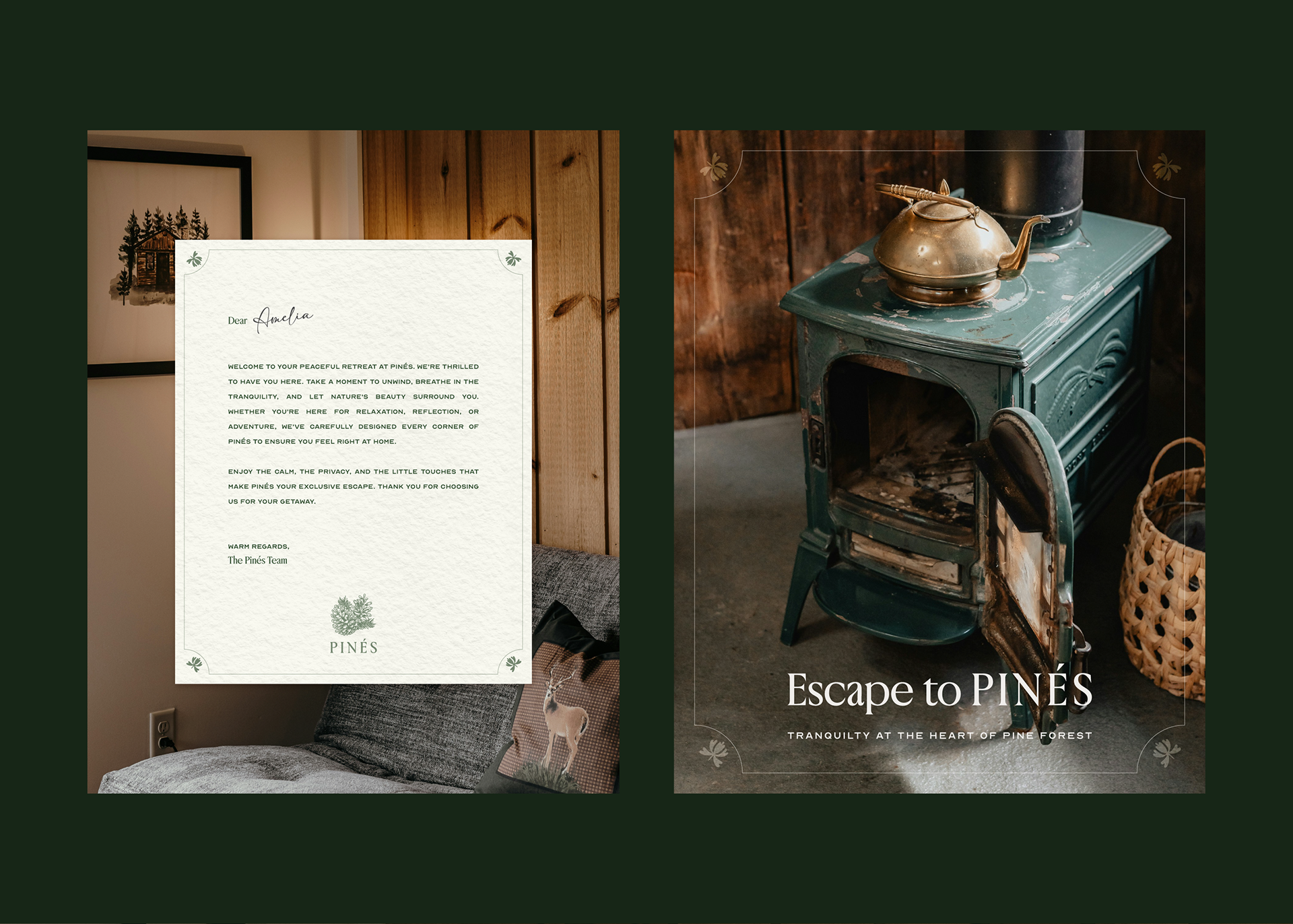
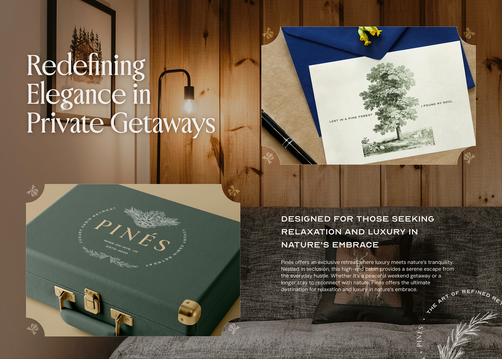
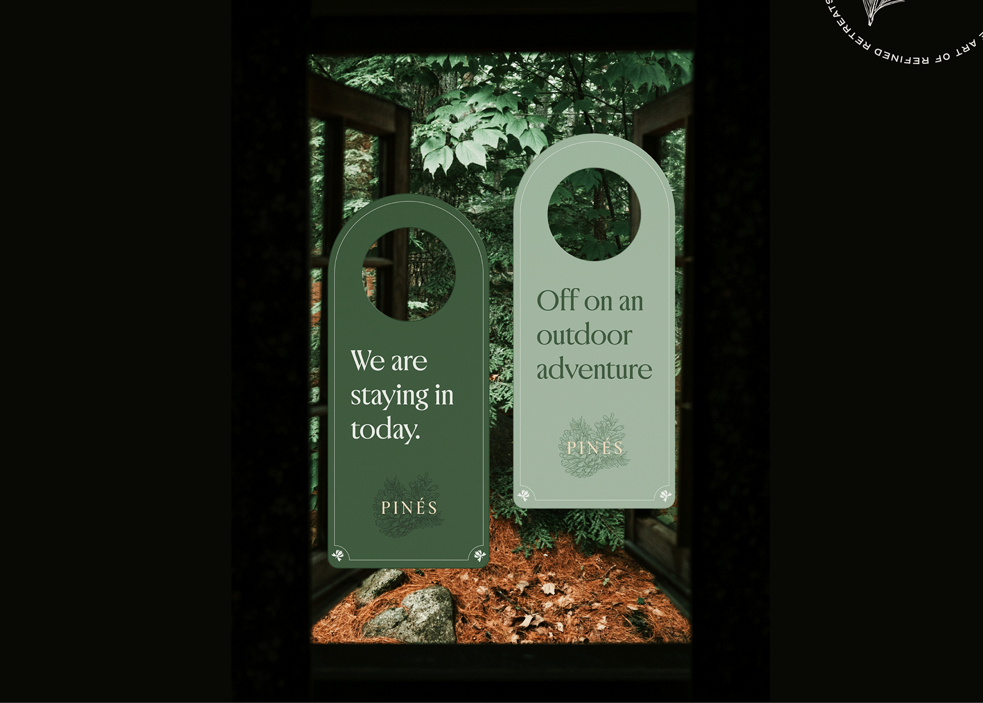
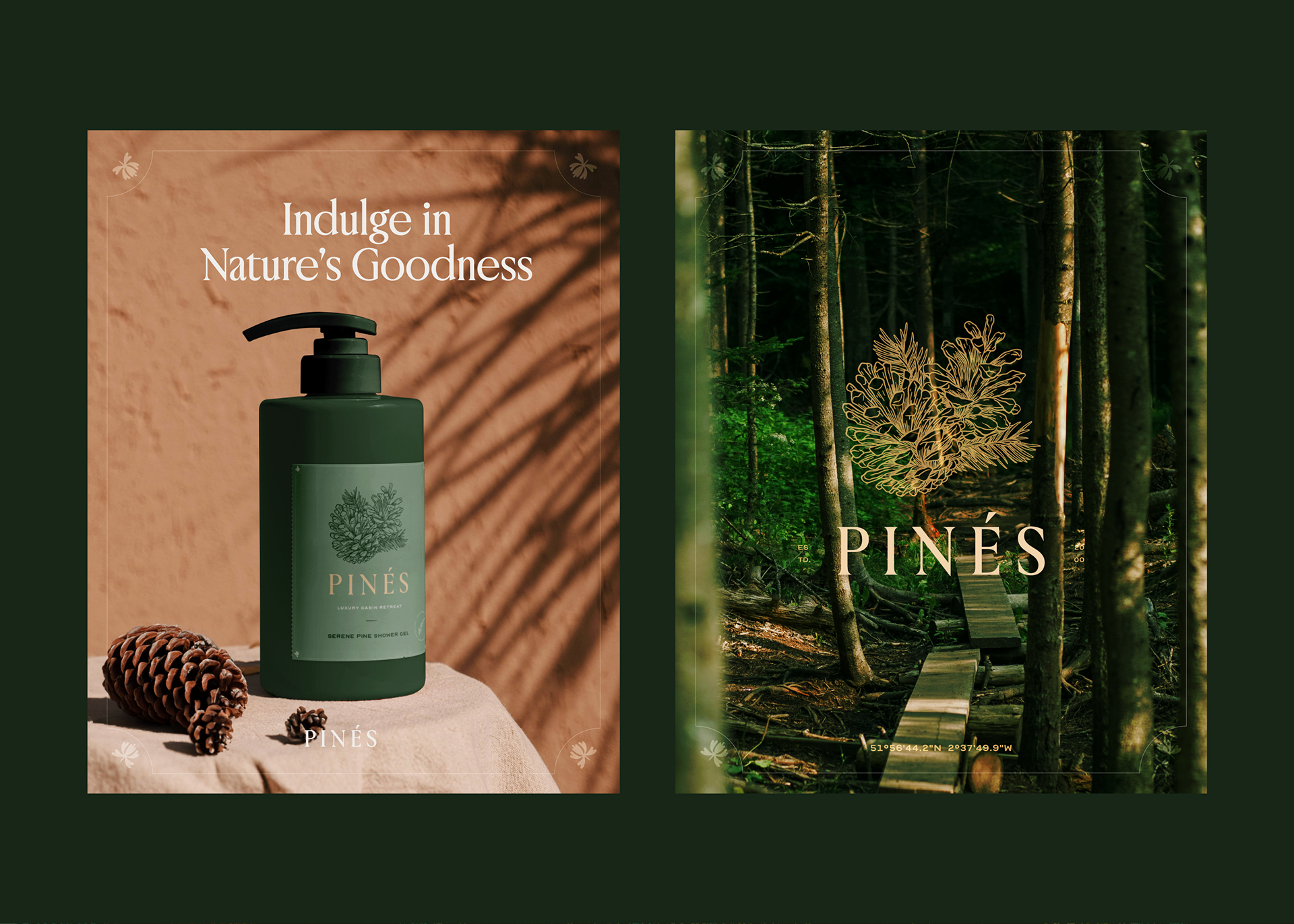
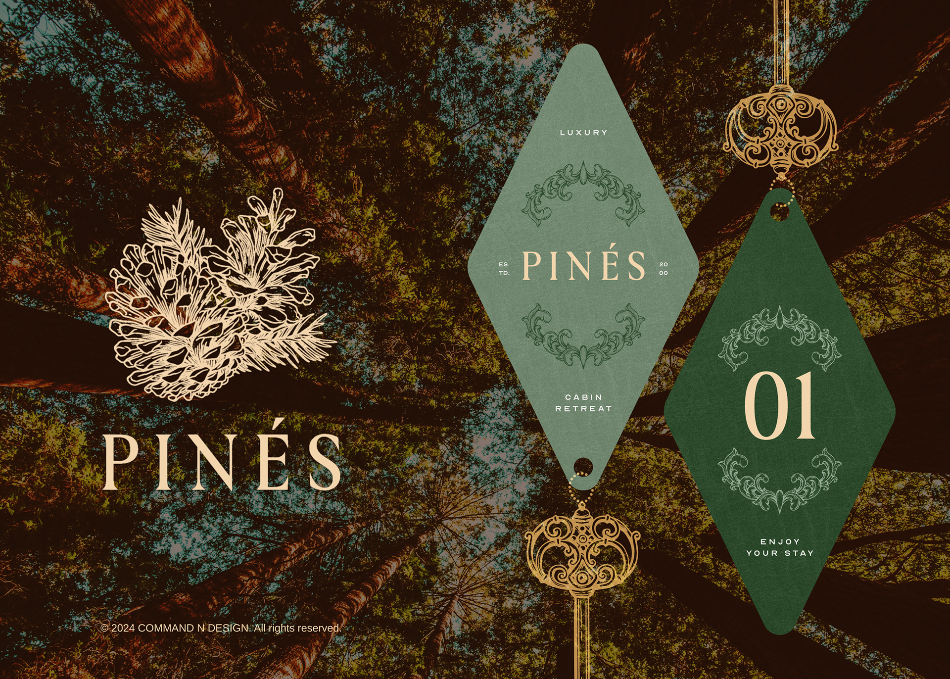
THE ILLUSTRATION
Vintage illustrations play a vital role in the hotel's branding, thoughtfully integrated into
various elements such as the hotel keys, letterhead, and decorative accents throughout the property.
various elements such as the hotel keys, letterhead, and decorative accents throughout the property.
By incorporating these illustrations, Pinés aims to evoke a sense of nostalgia and charm,
making every interaction feel personal and memorable. This artistic touch enhances the guest
experience, fostering a connection between visitors and the hotel's heritage.
making every interaction feel personal and memorable. This artistic touch enhances the guest
experience, fostering a connection between visitors and the hotel's heritage.